Liza Zulkarnaen's Portfolio
Alexa Site Audit Redesign
UI, UX & Interaction Design
Liza Zulkarnaen's Portfolio
UI, UX & Interaction Design
Redesigning the Alexa Site Audit is a non-easy task. Alexa Site Audit is one of the features offered in the Alexa Pro Advanced plan.
It is one of the most used features in the plan. Alexa Site Audit is a comprehensive report about a site's performance from the SEO perspective
that will uncover missed opportunities that could make this site more easily found in search engines. The report has 29 topics and it's divided into
5 main categories: SEO, Performance, Security, HTML tags, and Reputation. I was the project owner and designer responsible for this project.
I started the project by analyzing the existing Alexa Site Audit report to understand what was working and what was not working. In general, this
feature offers a lot of great information for the user. There are lots of good stuff in the report. However, it felt so dense, a little overwhelming,
visually outdated compared to the rest of the site, and hard to navigate within the report itself. There are a couple of other improvements that we could
do for this feature, however, after looking at the business goals, technical constraints and discussing with the other stakeholders, we decided to focus
on improving the user's workflow within the report for this first part of the redesign project.
The improvements that we made were focused around 2 questions: "What things do users pay attention to?" and "What are the tasks that the user is trying
to achieve?". Let's dive into the first question.
|
|
The first question |
|
What things do users pay attention to?
1. Track the progress of their Site Audit report's grade
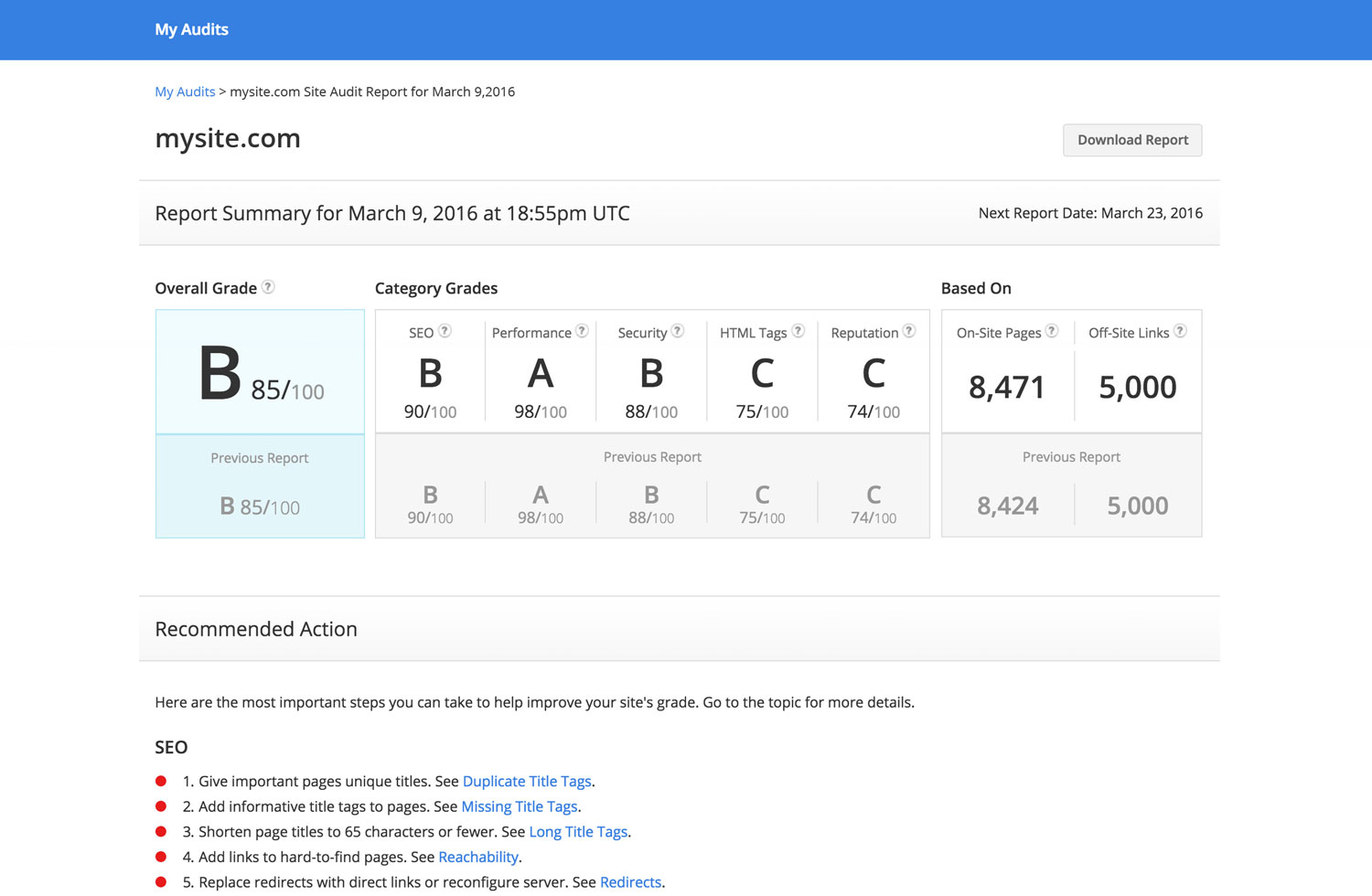
We realized that one main thing that users paid attention to was the report's overall grade. They kept an eye of this grade and manually tracked
the progress from one report to another. Even a single point difference is important for certain type of users.
In the re-designed report, we brought in the previous report's grade right into the latest report. Not only the overall report's grade, but we
also brought in the categories' grade into the report and display them right above the fold as the main summary information. Now, they can see their progress from one report to another efficiently.
What things do users pay attention to?
2. List of things that they need to do
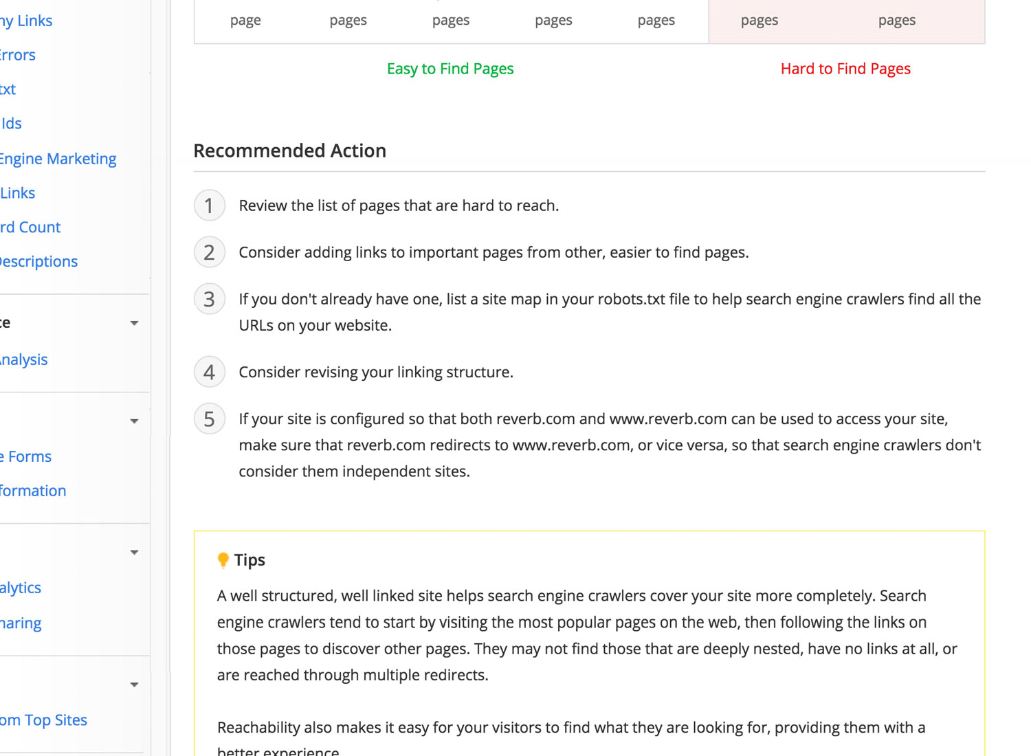
Each topic in the report is unique. It has its own instructions that the user needs to follow to fix the problem.
Therefore, we need to make it easy for the user to quickly find those instructions from one topic to another topic.
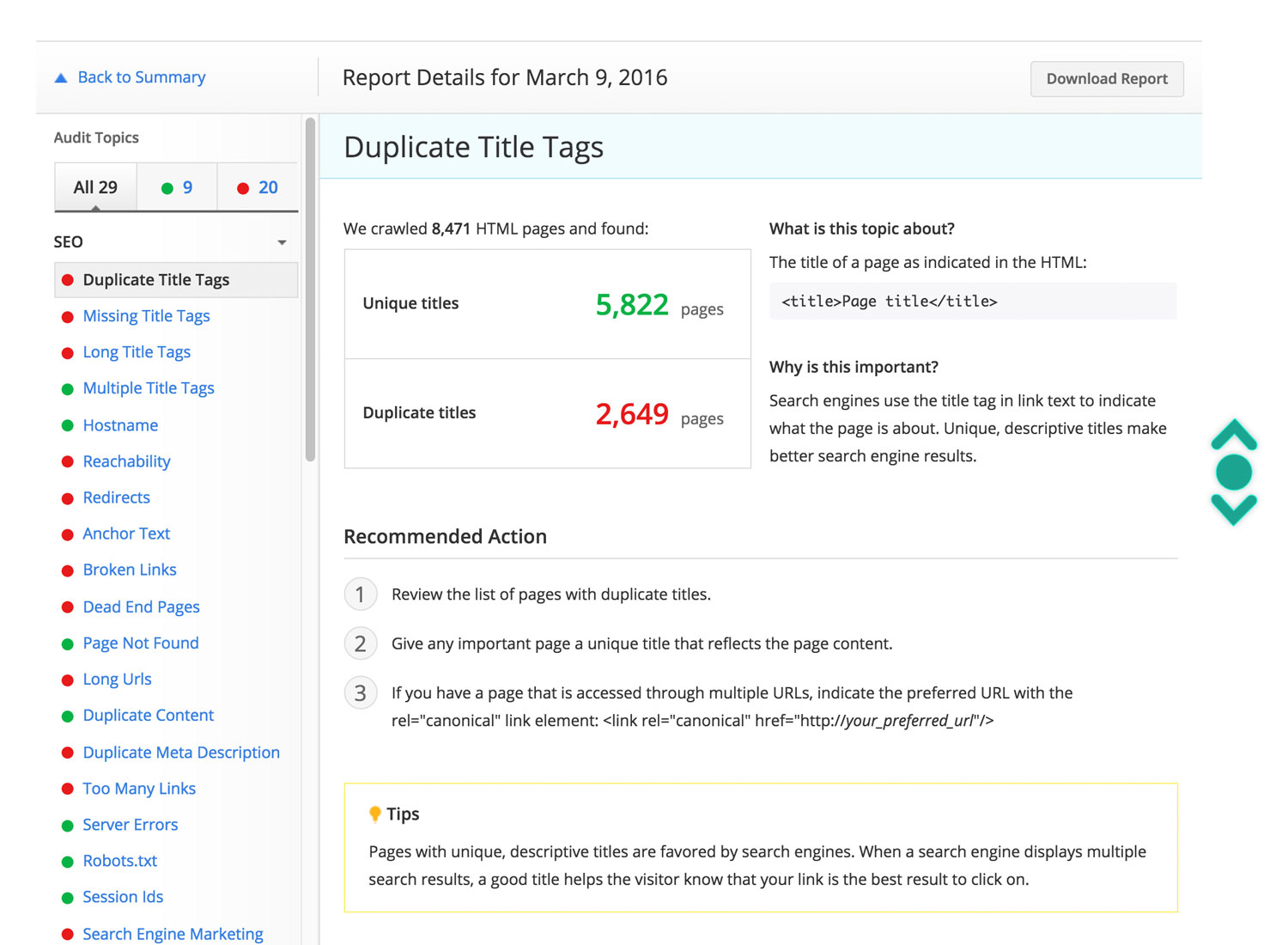
In the re-designed report, we re-organized the content's structure and created a master template for a topic.
All of the instructions will be placed in the "Recommended Action" section. Though not all of the topics
could use the master template because of their unique content, the idea is to create a pattern or visual cue to help guide the user
to find the instructions as quickly as they can when they navigate from one topic to another.

|
|
The second question |
|
What are the tasks that the user is trying to achieve?
1. Focus on the problems that they needed to fix
The Site Audit report has 29 topics in total. It's possible for a user to fail all of the topics within 1 category or various topics from
different categories within the report. When they are in their 'work mode', they just want to get things done.
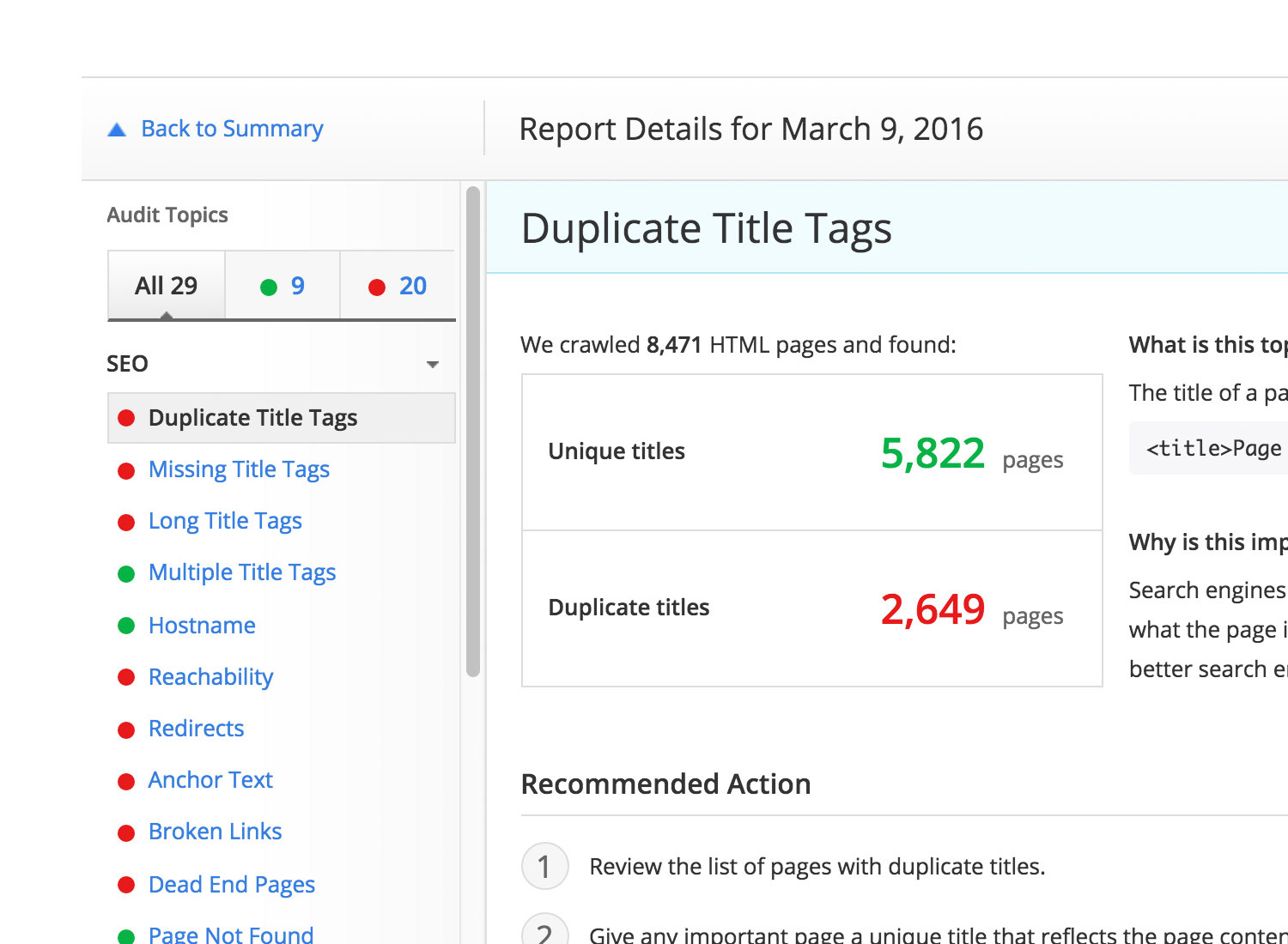
In the re-designed report, we added a new feature to the report's navigation; topic filters. With these filters, the user would be able to see the report in three different modes:
show me only topics that I passed, topics that I need to fix or all of them.
With these filters, when the user is in their "work mode", they can easily select the filter to focus on the topics that they need to fix and hide the rest that doesn't
really need their attention at that moment.
What are the tasks that the user is trying to achieve?
2. Know what this topic is about and why it matters
We understand that optimizing your site's SEO is not an easy task. And if you're new to the process, it could be daunting. You know you have to do it. There are so
many best practices out there that you can read to help guide you. But you don't really understand why.
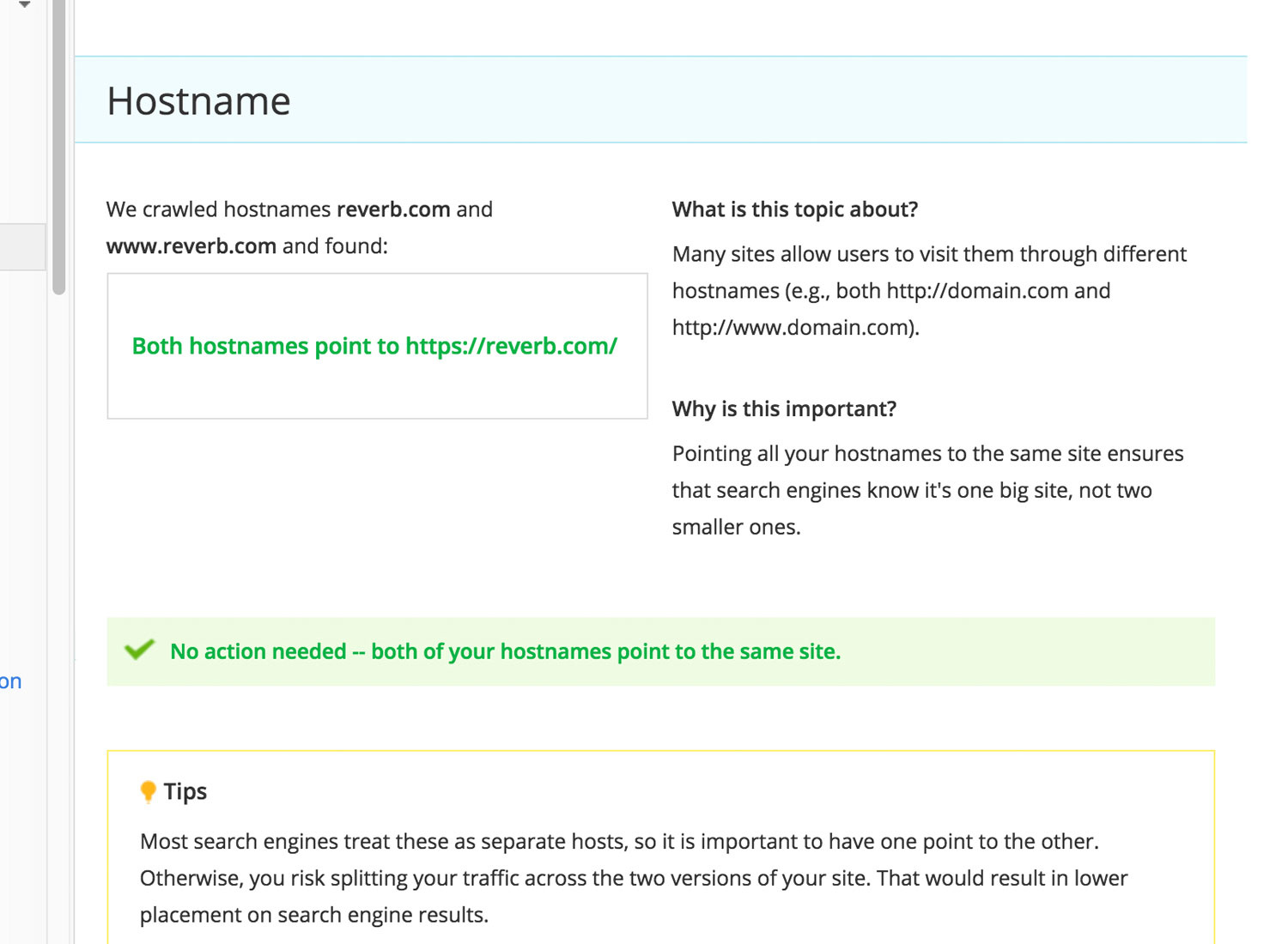
In the re-designed report, besides giving user recommendations, we also want to guide them. Give them more context why this
particular topic is important and what it can do for your site's SEO. We achieved this by adding two new sections for each topic; "What is this topic about?" and
"Why is this important?".
The content for these 2 questions is unique for each topic. Combined with the recommendations, they will motivate
the user to fix the problems even more because they will get a better sense of the impact of those changes.

What are the tasks that the user is trying to achieve?
3. Navigate the report easily
With potential 29 topics to pay attention to and in 5 different categories, easy navigation is important. We also understand that everybody works differently.
One might want to go through the report from one topic to another in order. One also might want to pick and choose the topics to focus on.
In the current Site Audit report, it has the left menu as the main navigation and it's working well, so we want to keep that. However, to go from one topic to another, you have to click through
each topic in the left menu. That could be a lot of clicks, just to get around. To make this task easier, in the re-designed report we implemented the infinite scroll.
The infinite scroll, together with the left menu has made the report navigation smoother. No matter how you want to work with the report, you can navigate
around easily and smoothly.
These are just the beginning of the re-designed effort. We have more exciting improvements planned for next phase. However, for this first phase, we believed
that we got it right. Our goal was to focus on improving the user's workflow within the report and we believed that we have achieved that goal.
The re-designed Site Audit report is an optimized, better, faster and more efficient report for the user's workflow.
Adobe Illustrator • Adobe Photoshop