Liza Zulkarnaen's Portfolio
Alexa New Dashboard 2016
UI, UX & Interaction Design
Liza Zulkarnaen's Portfolio
UI, UX & Interaction Design
Alexa Dashboard is one of the most important pages for Alexa's users. Like most web application system, it is the
first page where the user will land on once they are logged in. In the Alexa dashboard, the user would be able to see various metrics associated with their
site and subscription. But another important aspect of the Alexa dashboard is, it provides access to the various tools that they are eligible to according to their
subscription level.
As more products were being launched, and the need to represent them in the dashboard, it started to become apparent that the current dashboard
was not holding up. It was time to revisit the dashboard and redesign the dashboard experience.
I started by analyzing the current dashboard, so we could identify things that were working, things that were not working and things that could be improved.
Aligning with the overall business goals, together with the Project Manager, we created a roadmap for the Alexa Dashboard redesign project and started the first phase.
I was the project owner and designer responsible for this project. Working with the team, we made a lot of changes to the dashboard, good changes, that we believed
will provide a better dashboard experience.
1. Widget to a card
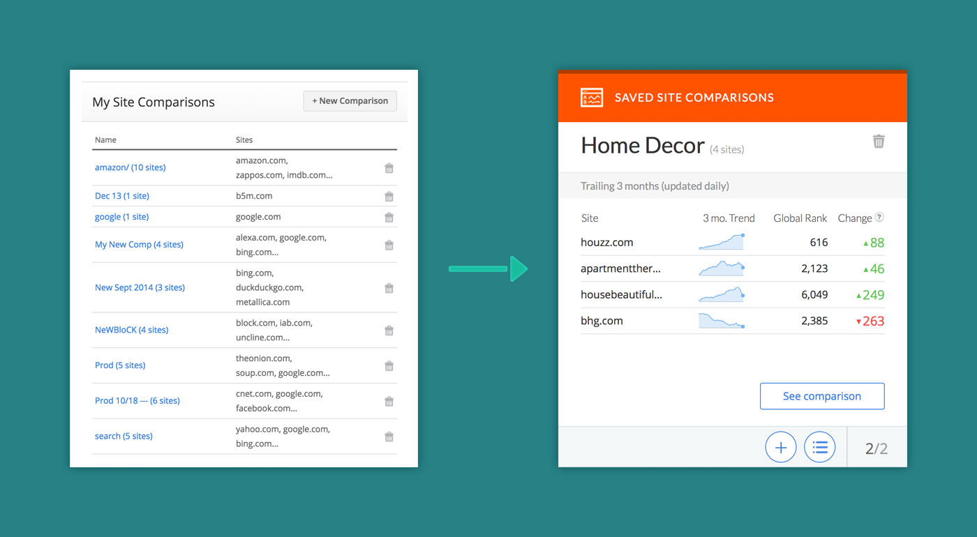
Left: The original Site Comparisons widget - Right: The new Site Comparisons card for Alexa Dashboard 2016.
I would say this was the biggest change that we've done to the dashboard. We completely changed the dashboard paradigm and it's for the better. In the current
dashboard, it was more focused on giving the user access to the tool that they have access to and it was presented in a form of a widget. Each widget was different
and it is self-contained. Each tool has its own set of metrics and for the most part, they did not rely on the other tools to function. Because of this model,
I changed the widget design to a card-based design.
I was not trying to follow the card-based design trend, but in this case, a card-based design fits our tool structure's model. A card is a single unique entity.
It is self-contained, which means all of the user actions, and contents belong only to that specific card or entity. And with the card model, we are not utilizing
it to just give the user access to the tool, but it gives us the opportunity to bring certain information to their attention.
Visually, it creates a better separation and distinction between each tool compare to its current widget form.
2. Each card is unique to the tool
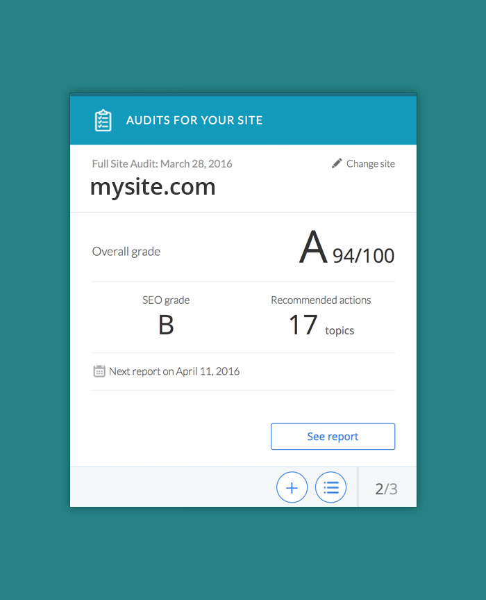
Alexa Site Audit card |
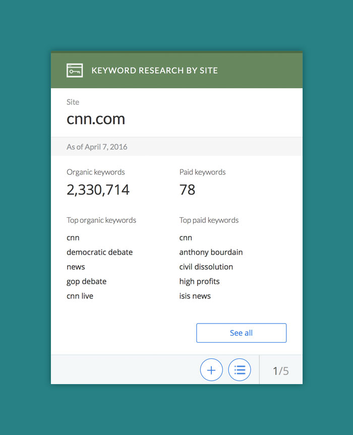
Keyword Research by Site card |
Alexa Dashboard is the main place for the user to access various tools in their subscription. Each tool has their own purposes,
actions, and metrics associated with it. With the card model, since each card is unique, we don't have to make all of the
tools look the same. We can design each card differently and uniquely as needed and make it more contextual with the purpose
of that particular tool. For some tools, maybe a list of results is more useful than a bunch of graphs.
That goes the same with the user actions within the tool. There are some tool-specific user actions that only applies
to that particular tool. With the card model, we can contain those actions on that card and only for that particular tool.
3. Consistency also matters
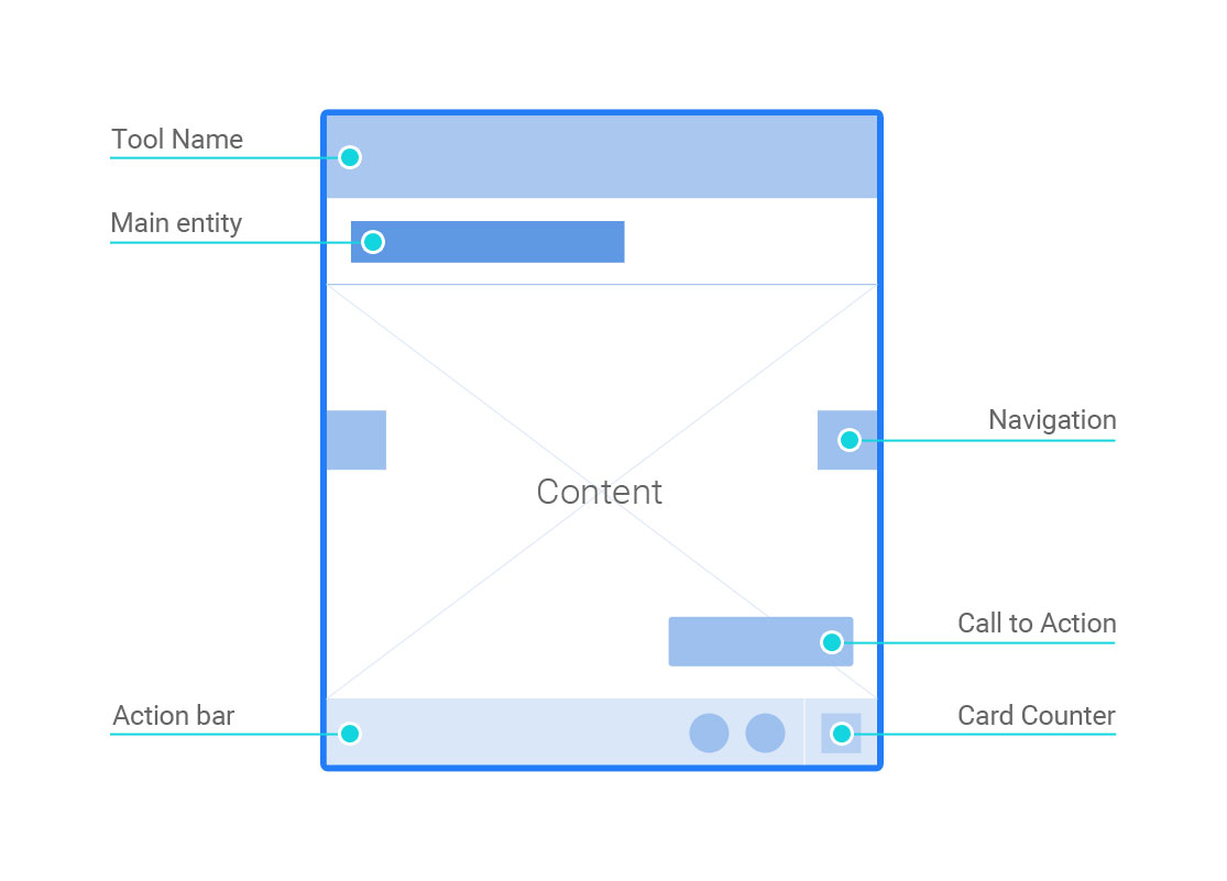
Structure of a dashboard card
Even though we have the freedom to design each card as unique as we needed and not tie it to a single template, doesn't mean we
can design freely and make them look like whatever we want. When dealing with a system or interface, the user often relies on familiarity,
pattern or consistency. No matter how unique each card on the dashboard will be, there are some general elements that will tie all of
them together and make them feel that they all belong to one system.
We created UI patterns and card structure that are applicable across the cards. One example is the in-card navigation. No matter which
card that you're working on, you can either use the slider or use the List View to get to a specific content of the tool. The same goes
for the visual patterns. Even though they don't all look the same, we created a pattern for the visual hierarchy of the cards.
4. Focus on what matters
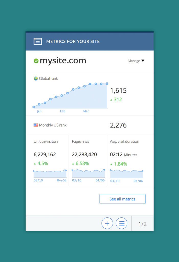
Metrics For Your Site card focuses on 5 important metrics of that site as the indicators of how their site is performing. |
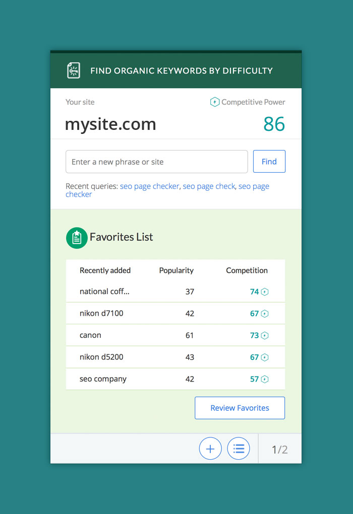
Keyword Difficulty card focuses on giving them quick access to perform keyword exploration and returning to their previous searches. |
Another great thing about the card-based design is the constraint that it introduces us. Like most card-based design, often a card is not
as wide as the width of your monitor screen. It is small and compact. You have a limited amount of space to put the information that you want to convey.
It forces us to really think about which information that really matters for the user at that particular moment. Since the purpose of each tool is different, we can not box the
answer to 1 single metric or template. The card model allows us to have flexibility and really make the main information of the card contextual with the purpose of the tool.
5. Refreshing new look
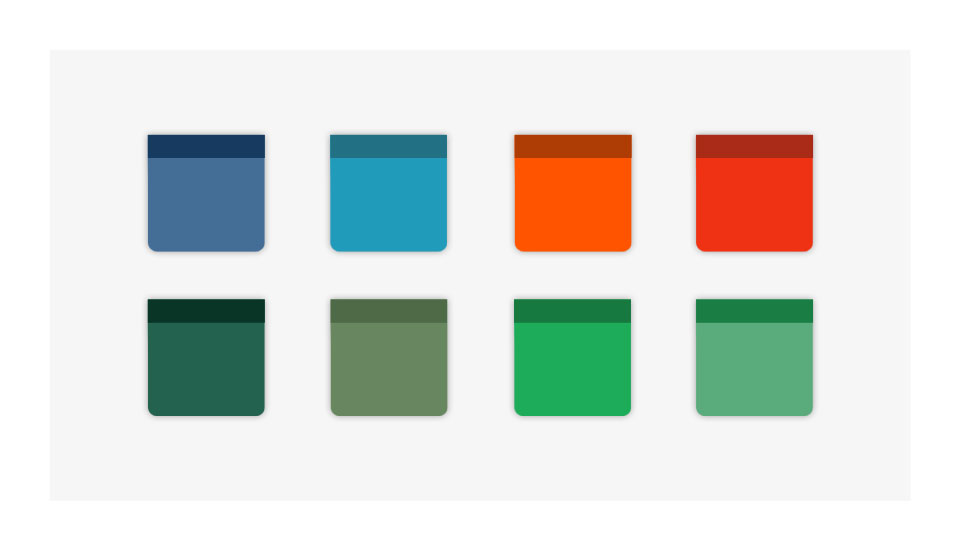
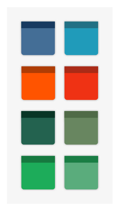
The redesign effort also gave us the opportunity to update the visual presentation of the dashboard. Compare to the previous dashboard, we introduced more colors to the redesigned dashboard to create a more inviting and engaging atmosphere. These colors also help the users to quickly differentiate from one card to another. Eventually, these colors will also be carried over to the tool themselves to further create a unity for the entire product experience.
These are just the beginning of the Alexa Dashboard redesign effort. We have an exciting product roadmap ahead of us in Alexa that will make the Dashboard and product experience even better. Nevertheless, for this first phase of the effort, I believe we're off to a good start.
Adobe Photoshop